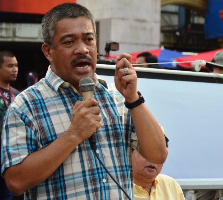
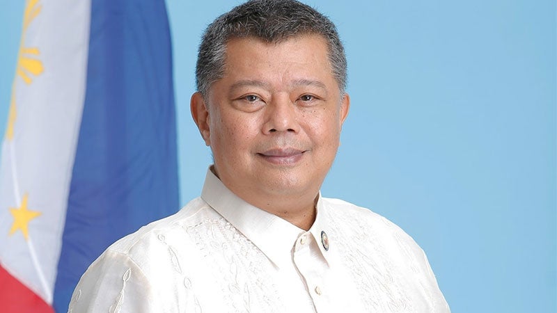
📷: Bicol Saro Partylist Rep. Terry Ridon
The House of Representatives has elected Bicol Saro Partylist Representative Terry Ridon as chairperson of the Committee on Public Accounts, rounding out the leadership of the reconstituted “Quad Comm 2.0,” a key bloc of four committees tasked with probing state-sponsored violence, illegal drug operations, and organized crime syndicates.
A lawyer from the University of the Philippines and a graduate of Harvard University in public policy and business, Ridon joins fellow committee chairs in the revived coalition:
– Rep. Bienvenido Abante Jr. (Human Rights, Manila 6th District)
– Rep. Rolando Valeriano (Public Order and Safety, Manila 2nd District)
– Rep. Jonathan Keith Flores (Dangerous Drugs, Bukidnon 2nd District)
The revival of the Quad Committee marks a renewed commitment under the 20th Congress, led by Speaker Ferdinand Martin G. Romualdez, to reinvestigate unresolved cases of state-backed violence, corruption, and criminal impunity — many first exposed in the 19th Congress and reignited by recent disappearances linked to illegal cockfighting.
Ridon’s appointment further empowers the Public Accounts Committee to probe financial and operational irregularities tied to abuses of public trust and government authority.
In the same plenary session, several lawmakers were elected to lead both standing and special House committees:
– JC Abalos (4Ps Party-list): Ethics and Privileges
– Florencio Miraflores (Aklan 2nd District): Local Government
– Cheeno Miguel Almario (Davao Oriental 2nd District): Social Services
– Jose Arturo Garcia Jr. (Rizal 3rd District): Flagship Programs and Projects
– Kristine Alexie Tutor (Bohol 3rd District): Globalization and WTO
– Mark Cojuangco (Pangasinan 2nd District): Nuclear Energy
– Alexander Pimentel (Surigao del Sur 2nd District): Strategic Intelligence
– Alfelito Bascug (Agusan del Sur 1st District): Persons with Disability
– Maria Angela Garcia (Bataan 3rd District): West Philippine Sea
The House also formalized its minority leadership structure:
– Senior Deputy Minority Leader: Edgar Erice (Caloocan City 2nd District)
– Deputy Minority Leaders: Include Reps. Presley De Jesus (PHILRECA Partylist), Sergio Dagooc (APEC Partylist), Kaka Bag-ao (Dinagat Islands), Stephen James Tan (Samar, 1st District), Leila De Lima (ML Partylist), Perci Cendaña (AKBAYAN Partylist), Antonio Tinio (ACT TEACHERS Partylist), Jesus Manuel “Bong” Suntay (Quezon City, 4th District), Jernie Jett Nisay (PUSONG PINOY Partylist), Reynolds Michael Tan (Samar, 2nd District), and Cielo Krisel Lagman (Albay, 1st District).
– Assistant Minority Leaders: Include Reps. Christopher Sheen Gonzales (Eastern Samar), Renee Louise Co (KABATAAN Partylist), Chel Diokno (AKBAYAN Partylist), Robert Nazal (BH Partylist), Niko Raul Daza (Northern Samar, 1st District), JP Padiernos (GP Partylist), Audrey Kay Zubiri (Bukidnon, 3rd District), and Iris Marie Demesa Montes (4K Partylist).
Speaker Romualdez reaffirmed the vital role of the minority bloc in upholding institutional checks and balances, fostering transparency, and ensuring the democratic process. (JCNE)

Implementing a Facebook account quality assessment checklist 2026 ensures you’re acquiring accounts that meet platform standards and maintain long-term viability. Many digital agencies and performance marketers struggle with account quality issues after purchase, discovering too late that accounts have hidden restrictions, warning flags, or compliance violations. The checklist covers critical dimensions: verification status across Facebook’s systems, historical action history review, geographic footprint alignment, and account health indicators that predict suspension risk. By evaluating these factors systematically, you can distinguish premium accounts from disposable ones and make informed purchasing decisions. Teams managing multiple accounts for campaigns will significantly reduce churn and campaign disruption by applying these assessment standards before onboarding.
Selecting the right antidetect browser selection guide for media buyers has become essential for professionals managing multiple ad accounts across Facebook, Google, and TikTok without triggering platform detection systems. Media buyers operating at scale face an ongoing challenge: advertising platforms increasingly flag accounts running from the same infrastructure, IP, or browser fingerprint, resulting in account suspensions and campaign interruptions. This guide breaks down the critical evaluation criteria—fingerprint randomization quality, browser stability under concurrent multi-account sessions, and native integration with proxy services—that separate enterprise-grade solutions from unreliable tools. You’ll learn how leading antidetect browsers mask device identifiers, canvas fingerprints, and WebRTC leaks while maintaining compatibility with your existing workflow and traffic sources.
While going through different school and academic platforms, I noticed something within the content discover more here and it appears professional and welcoming, creating a strong first impression that feels structured and trustworthy
согласование перепланировки в москве [url=https://pereplanirovka-kvartir15.ru/]согласование перепланировки в москве[/url] .
super cherry 5000 tricks [url=https://sheikhjameel.com/super-cherry-50-100-und-200-die-mittleren-varianten-im-detail]super cherry 5000 tricks[/url]
crazy time play [url=https://thegadgetview.com/watching-crazy-time-without-betting-how-to-spectate-learn-the-game-and-decide-if-its-for-you]crazy time play[/url]
1xbet turkiye [url=https://nupel.net/]nupel.net[/url] .
услуги по перепланировке квартир [url=https://pereplanirovka-kvartir16.ru/]услуги по перепланировке квартир[/url] .
проект на перепланировку квартиры заказать [url=https://proekt-pereplanirovki-kvartiry26.ru/]проект на перепланировку квартиры заказать[/url] .
While exploring high performance web pages, I encountered explore smooth loading hub – The site has a clean interface, fast loading speeds, and smooth functionality that makes browsing feel effortless and well optimized.
mitchwantssununu.com – Interesting concept site, content feels direct and somewhat thought provoking today
As I browsed different holiday-themed websites, I noticed read festival details – The content feels fresh and inviting, providing a smooth reading experience that makes it easy for visitors to explore and understand the information quickly.
While reviewing digital storefront platforms emphasizing usability and simplicity, a strong example is Frost Glade Unified Vault where feels structured and simple, making it easy to explore content, making navigation feel consistent, intuitive, and easy for all users.
Users who appreciate traditional styled ecommerce platforms often browse sites such as Wheatfield Cove Outpost Store where navigation is clear and uncluttered – The rustic theme creates a welcoming atmosphere, helping users easily find products while enjoying a calm and visually consistent shopping experience.
Users who enjoy bright ecommerce environments often engage with sites such as Cove Sun District Goods Store Hub where products are arranged in a well structured layout – The design ensures a smooth browsing experience that feels pleasant, organized, and easy to follow throughout the shopping journey.
While browsing curated Hawaii lodging collections and boutique stays, I recently discovered a beautifully presented property showcase that stood out significantly < holualoa retreat overview – The presentation feels calm and inviting, offering a relaxing overview that highlights comfort, scenery, and thoughtful hospitality details overall
While searching through personal commentary platforms I discovered a site that shares perspectives in a simple and unembellished way featuring direct views archive – the content is structured in a way that feels intentionally provocative while still remaining accessible and easy to follow for readers
Users who prefer structured ecommerce systems often appreciate clear categorization that helps them quickly locate items without feeling overwhelmed by excessive visual noise cove emporium gilded selection – The presentation style supports efficient browsing with well organized sections that make product discovery feel natural and uninterrupted across the platform.
Across various e-commerce experience evaluations focused on usability, a notable example is Gilded Brook Network District where nice visual balance and navigation works without any confusion, helping users interact with a clean and efficient browsing environment across all pages.
People who enjoy well organized ecommerce hubs often explore sites like Harbor Kettle Commerce Essence Hub where items are arranged in a clean format – The design ensures browsing feels clear, smooth, and easy to navigate across all sections.
While comparing seasonal festival platforms, I stumbled upon this winter event page – The site feels vibrant and helpful, with content that is easy to read and structured in a way that keeps users interested throughout their visit.
People who enjoy well designed online goods districts often engage with platforms like Cove Sun District Goods Market where items are displayed in a structured and friendly layout – The browsing experience feels smooth and pleasant, with clear organization that helps users move through categories easily and comfortably.
Users browsing curated ecommerce vault systems often respond positively to layouts that prioritize structure and clarity while reducing unnecessary visual clutter during shopping sessions Harbor Glass Vault Market – The design is organized and minimal, ensuring a smooth browsing experience where products are clearly displayed and easy to explore across categories.
Users who prefer modern artisan marketplaces often engage with sites such as Wave Artisan Trail Market where product listings are displayed in a clean and visually appealing format – The design supports easy navigation and highlights creativity, ensuring each item feels thoughtfully presented and easy to browse through structured categories.
modelscanvas.com – Creative portfolio vibe, visuals and layout feel clean and professional design
While exploring creative online shopping concepts, I came across a supermarket themed website that uses a very simple and direct layout style hope virtual grocery store – The presentation is minimal yet effective, making it easy for users to understand the concept quickly
While evaluating modern online stores designed for clarity and UX flow, a notable example is Night Glade Trade Hub House where everything feels straightforward and browsing is comfortable and stable, allowing users to interact with content in a clean and efficient manner.
While searching for clear and useful support organizations, I encountered access this page – The content is easy to read and well structured, making it practical for users seeking straightforward guidance.
People who appreciate artisan focused ecommerce design often browse platforms like Cove Vendor Teal Artisan Creative Market where items are arranged in a stylish and structured format – The layout ensures browsing feels smooth, visually appealing, and thoughtfully organized for an enhanced user experience.
People who enjoy minimal vendor-style organization often engage with platforms like Meadow Apricot Works Vendor Design Hub where items are structured clearly – The interface makes browsing feel creative, accessible, and easy to use across all sections.
While browsing artistic presentation websites I came across a platform that delivers a clean and minimal layout featuring creative visuals display page – the structure feels intuitive and refined making it easy to navigate while maintaining a strong visual identity overall
Many consumers now prefer online artisan platforms that emphasize handmade authenticity and transparent pricing structures Craft Heritage Network – helping them build trust in independent creators while enjoying a diverse selection of culturally inspired goods available worldwide online.
While going through various resources on the topic, I discovered find out more – The explanations are straightforward and easy to grasp, helping readers quickly understand the key ideas without confusion or unnecessary detail.
valeharborcraftemporium.shop – Site works well on phone, checkout was smooth today.
карниз с приводом для штор [url=https://elektrokarnizy-dlya-shtor150.ru/]elektrokarnizy-dlya-shtor150.ru[/url] .
While reviewing online vendor marketplaces and creative product platforms, I came across Birch vendor marketplace room – the platform emphasizes organized presentation and user friendly navigation that allows visitors to engage with listings in a simple and intuitive way.
электрокарнизы для штор купить [url=https://avtomaticheskie-karnizy.ru/]электрокарнизы для штор купить[/url] .
электрокарнизы москва [url=https://elektrokarnizy777.ru/]электрокарнизы москва[/url] .
электрические гардины [url=https://elektrokarnizy33.ru/]elektrokarnizy33.ru[/url] .
Users who value stylish ecommerce experiences often engage with sites such as Ginger Stone Curated Galleria where products are displayed in a fluid gallery inspired layout – The design emphasizes elegance and usability, ensuring browsing feels intuitive, visually appealing, and consistently smooth throughout the store.
As I reviewed examples of online commerce hub systems, I checked see this wave harbor commerce page – I appreciate the effort here, and the site feels polished, user friendly, and easy to browse without confusion.
While searching for frontier themed ecommerce platforms I found a clean and structured store that focuses on usability and simplicity featuring frontier rustic depot – the interface supports easy navigation and maintains a consistent rustic aesthetic that feels both practical and visually cohesive
As I reviewed different eCommerce platforms focused on outdoor lifestyles and gear presentation, I noticed visit this outdoor hub – Its clean design approach stands out, and moving between sections feels fluid, allowing users to browse comfortably without feeling overwhelmed or lost.
While browsing travel inspiration platforms I came across a luxury lodge site that highlights premium stay experiences with polished visuals and a welcoming structure making it appealing for users interested in refined getaway options luxury nature lodge hub – The presentation feels immersive and premium throughout
As part of a usability comparison study on outdoor commerce platforms, I analyzed how layout decisions impact the ease of finding relevant products efficiently SummitCoveShop – revised insight: navigation remains clean and direct, helping users move through sections without confusion or delay.
Digital shoppers often rely on structured vendor systems that organize products clearly and make browsing more efficient especially for frequent online buyers Craft Vendor Board – These platforms improve user experience by reducing search complexity and enhancing product visibility across listings on marketplaces online platforms
While exploring online marketplaces with themed branding and structured layouts I came across a platform featuring mountain trade hub – the alpine inspired design adds a refreshing feel and the browsing experience remains clean, organized, and easy to navigate across different product sections
автоматические жалюзи с электроприводом на окна [url=https://elektricheskie-zhalyuzi5.ru/]автоматические жалюзи с электроприводом на окна[/url] .
In the middle of evaluating various content platforms, I saw go to this site – The layout is visually pleasing and intuitive, helping readers engage with the material without distractions.
умная нейросеть для учебы [url=https://nejroset-dlya-referatov-29.ru/]умная нейросеть для учебы[/url] .
реферат через нейросеть [url=https://nejroset-dlya-referatov-26.ru/]реферат через нейросеть[/url] .
During a review of modern vendor atelier websites, I found browse wave harbor creative hub atelier – Browsing here is pleasant, with well defined categories that are easy to navigate and understand quickly.
Users who prefer efficient shopping platforms often engage with sites such as Acorn Vendor Harbor Hall Zone where product listings are arranged in a structured and accessible way – The design supports easy browsing by keeping categories clear and navigation straightforward throughout the entire marketplace experience.
As I explored various artisan boutique platforms online, I checked see velvet brook artisan design shop – I would recommend this to anyone who loves handmade goods because the collection feels meaningful and creative.
роликовые шторы [url=https://elektricheskie-rulonnye-shtory77.ru/]роликовые шторы[/url] .
As I explored various structured eCommerce platforms focused on clarity and usability, I found check harbor trade site – The presentation is neat and organized, and the browsing experience feels simple, making it easy to locate information quickly.
While browsing through various resource collections and curated marketplace pages, I came across something that felt organized and easy to interact with, especially Vendor hall access point which supports a clear and efficient browsing flow – Noticed this recently, seems quite helpful and easy to explore, with an interface that feels calm, structured, and practical for repeated use.
Curious buyers exploring artisan marketplaces often value platforms that organize unique handmade goods while maintaining a strong focus on creator visibility and fair exposure Handcraft Collective Point – this structure helps simplify browsing while encouraging appreciation for handcrafted cultural expressions worldwide
In reviewing digital vendor platforms designed for structured browsing and accessibility, I encountered a layout where informational text connects naturally with Harbor canyon trade listing board embedded within the central content, enhancing usability – It delivers organized categories and a smooth browsing experience that helps users find relevant products quickly and easily.
Users who appreciate clean ecommerce design often value goods stores that combine simple navigation with structured product presentation Marble Harbor Daily Goods Shop – The interface ensures intuitive browsing with consistent layout patterns helping users quickly find items while maintaining a balanced and visually clear environment that enhances overall shopping efficiency across all platform sections today experience flow.
While browsing cruise planning resources I discovered a travel site that provides cruise details in a straightforward and organized way designed for users looking into sea based holidays cruise route guide – The content feels clear and travel oriented
Users exploring visually refined ecommerce concepts often notice how curated floral themed digital spaces enhance browsing experience when they encounter Floral Vault Showcase which presents a carefully structured selection of items arranged with artistic balance and subtle elegance that improves product discovery flow – The design draws from floral inspiration and presents a curated vault-like aesthetic that feels both refined and visually harmonious overall
While exploring vendor marketplaces and commerce directories on my phone, I came across a site containing Jasper trade harbor hall entry – The branding is solid and memorable, though the pages were surprisingly slow to load during my visit today.
As part of studying vendor atelier usability and structure, I explored check this wave harbor atelier site – Browsing here is pleasant, and categories are clear, simple, and easy to navigate throughout the experience.
Across ecommerce staging evaluations and organic UI prototype testing, analysts identified a mid layout content block featuring wild orchard workshop vendor portal integrated into interface flow, but product pages fail to show ingredient lists or nutritional details – Wild orchard feels organic and farm driven, however lack of ingredient transparency reduces usability and trust during customer decision making
People who enjoy structured online vendor systems often explore platforms like Harbor Chestnut Product Vendor Hall where items are displayed in a clean and organized layout – The interface makes browsing simple and efficient, helping users quickly scan listings and find products without confusion or delay.
During an exploration of practical web design approaches for straightforward shopping experiences, I discovered visit this simple shop – The structure is easy to understand, and moving through pages feels natural and functional.
Many craft enthusiasts prefer online outlets that showcase discounted handmade products while still maintaining a curated selection of quality items from different creators Artisan Outlet Express while improving shopping efficiency – this type of platform ensures users can access diverse craft goods quickly without losing focus on reliability and product standards.
While going through various curated directories and niche resource pages, I found something that seemed well arranged and user-friendly, especially when seeing Vendor harbor access page included – the experience feels smooth and logically structured, making navigation simple and overall pleasant to use without confusion.
As I explored several platforms offering guidance and support, I found open this page – The layout feels organized and inviting, helping users navigate effortlessly while absorbing helpful and clearly written content.
During a comparison of modern retail mart websites and their customer experience quality, I noticed discover night orchard retail hub mart – I bought a gift last week, and the packaging honestly felt really premium and well thought out.
Users who enjoy consistent ecommerce vault layouts often browse sites such as Harbor Elm Vault Network where products are presented in a structured format – The interface makes navigation feel secure, clean, and visually balanced across all categories.
While exploring online personal portfolios I found a clean and simple site that focuses on easy readability and direct communication making it suitable for users who prefer minimal design approaches casual creator page – The site feels smooth and uncomplicated
During a detailed evaluation of online vendor atelier websites focused on credibility and clarity, I noticed visit this harbor trail atelier – The site feels reliable, and the information presented appears accurate and easy to follow across different sections.
While browsing vendor marketplace listings I noticed Amber Harbor marketplace lounge entry – The branding is consistent, but the lounge area appears empty, which makes navigation feel less useful than expected.
Shoppers who value clarity in ecommerce design often prefer websites that structure content into logical categories and provide easy navigation systems that help them quickly identify relevant items without unnecessary complexity or visual distraction during browsing Crest District Opal Hub – The platform emphasizes organized layouts and user friendly navigation tools that ensure smooth browsing across categories while maintaining a clean and efficient shopping experience from beginning to end.
Digital retail platforms are evolving toward more structured models that enhance trust and operational efficiency across global ecosystems Guild commerce listing portal guild inspired architectures help standardize processes and improve coordination between different market participants – Structured guild marketplaces are valued for their ability to maintain consistent quality standards
As I explored different marketplace-style websites, I noticed a page featuring Goods Juniper Cove room entry link – It has an interesting aesthetic, but the lack of clarity about what they sell makes it somewhat confusing overall.
While analyzing how product arrangement impacts user experience, I checked see meadow store here – The site feels polished, and browsing across items is both simple and visually attractive.
While scanning through niche resource collections and suggestion pages, I noticed something that stood out for its simplicity and clarity, especially where Copper Cove vendor access page appeared – this seems like a solid platform where content is well organized and easily accessible for users.
During analysis of retail oriented platforms I observed a structured page where the Sweet cove vendor listing board is embedded within content sections, improving navigation – The hall looks dynamic today with varied product options and a simple browsing experience that helps users quickly find what they are looking for.
During a detailed review of online artisan marketplaces with diverse offerings, I noticed visit this oak cove craft hub – The variety is impressive, and the browsing experience feels enjoyable, making it worth spending extra time exploring different products.
Users who prefer warm structured digital marketplaces often explore sites such as Meadow Ember Unified Market where content is arranged cleanly – The interface creates a browsing experience that feels easy, consistent, and welcoming from start to finish.
In the middle of reviewing several online retail hubs I noticed a content block containing soft cotton meadow marketplace which gives a gentle visual impression, but the platform repeatedly logging users out creates interruptions that affect usability and makes product exploration feel less smooth than expected.
oakmeadowvendorcollective.shop – Really clean product photos, descriptions are helpful too.
In modern e-commerce environments businesses and shoppers both seek dependable platforms that reduce friction and improve trust during transactions especially when they encounter portals like Trusted Vendor Marketplace – this type of marketplace structure is valued for its streamlined navigation, efficient listing management, and overall balanced user experience that supports long term engagement
During my comparison of several online agencies, I encountered see more here – The overall impression is one of professionalism and clarity, with a layout that feels both modern and easy to follow.
During a review of handcrafted product websites with strong visual identity, I found see golden trail shop – The interface feels artistic and clean, and browsing across sections is smooth and easy to follow.
Many shoppers appreciate clean ecommerce interfaces that emphasize usability and aesthetic balance when discovering artisan collections through platforms like Chestnut Cove Artisan Goods Gallery – the browsing flow is smooth and uninterrupted, allowing users to explore products at their own pace – thoughtful design choices make the experience feel premium and approachable.
During browsing of niche online marketplaces I came across Harbor Moon vendor lounge entry portal – The design is calm and appealing, but I find the lack of detailed product imagery makes it harder to evaluate listings properly.
As I continued exploring curated online listings and marketplace directories, I found something that felt straightforward and accessible, particularly with Copper Harbor vendor showcase page – the simplicity of the layout helps make everything easier to grasp quickly and comfortably.
During research into modern artisan shopping platforms, I explored explore this upland cove market – The interface feels clean and efficient, and navigation is smooth, so finding items quickly is easy.
While reviewing staging ecommerce vendor systems and UI marketplace templates, analysts noticed a content block featuring ridge vendor amber parlor showcase console node integrated into layout flow, and despite the warm amber ridge concept suggesting a polished marketplace, the vendor parlor section feels like a placeholder element which weakens perceived completeness during usability testing sessions and design evaluations
While analyzing online vendor ecosystems I came across a clean interface that enhances browsing clarity where Harbor vendor product space Harbor vendor product space embedded within content improves structure – Vendor hall provides organized listings and smooth navigation allowing users to explore products without confusion simple clean flow.
While checking various ecommerce themed websites I found embedded in the main content a listing with creek harbor vendor hub portal and although the design is clean and creek inspired, the broken search filter makes it difficult to efficiently locate items or filter results properly.
During analysis of various online outdoor supply platforms, I focused on usability and clarity of product organization, and in the middle of that exploration I encountered Valley Edge Outpost Market – revised commentary: the layout feels simple and well structured, helping users navigate quickly and discover items without confusion or unnecessary distractions during browsing sessions.
Craft lovers browsing online often appreciate platforms that combine aesthetic design with functional usability and quick page loading times Evening Craft Collective delivering smooth browsing and organized product display for better shopping flow on modern devices today – This marketplace style supports both discovery and purchase efficiency in one place
rent a coworking space rent a coworking space
As I reviewed examples of calming website designs inspired by nature, I checked see this outlet page – The structure is clean and organized, and the browsing experience feels relaxed and easy to manage.
pebblecreekcraftexchange.shop – Will order again next month, hope they restock soon.
While comparing online goods district marketplaces, I discovered browse gilded shop district zone – The interface is structured and clear, and browsing feels intuitive, smooth, and user friendly throughout the site.
While exploring various online bargain listings I noticed Nightfall Trade House online deals entry – I went in expecting good savings, but the checkout flow felt suspicious, so I chose not to continue with any transaction.
Users who prefer streamlined online shopping often find value in platforms like Quick Lane Merchant Hub where categories are structured to support fast navigation and immediate access to products – The overall experience is built around simplicity and speed, ensuring browsing feels effortless and highly responsive at every stage.
As I continued exploring curated marketplace listings and online resource hubs, I found something that seemed simple and accessible, particularly with Meadow coral vendor link – The site feels pretty decent, and navigation works without confusion, so it’s easy to browse and understand everything quickly.
During usability testing of ecommerce marketplace systems and UI sandbox environments, testers found a navigation module containing marble harbor gallery trade vendor access portal link embedded mid layout, and although the marble harbor branding feels sophisticated and clean, the gallery images are low resolution which disrupts user satisfaction during interaction testing and evaluation processes
While scanning vendor marketplace pages I discovered a mid page element containing harbor creek commerce house trade hub and although everything looks structured and professional, it is so close to tradehall in design that it becomes confusing to differentiate between them quickly.
Modern online marketplaces benefit from intuitive structures that guide users through categorized listings while maintaining consistent usability and accessibility standards Nightfall Supply Hall – The vendor hall system presents a well ordered layout that supports efficient browsing and helps users identify relevant product categories with minimal effort
While analyzing various vendor focused ecommerce systems I found a well organized interface that helps users move through categories without confusion Chestnut vendor trade house hub and it maintains a reliable browsing structure that makes product discovery straightforward while keeping the layout visually appealing and easy to understand for everyday users.
During analysis of visually soothing storefront designs that prioritize user friendliness and soft presentation style I noticed embedded content where Brookside Velvet Hub appears naturally in the interface – updated note overall structure feels balanced gentle and easy to navigate supporting a relaxed browsing journey across categories
During a review of online retail district systems, I found browse oak cove retail space – The website runs efficiently, and everything feels stable, smooth, and free of confusion during navigation.
While studying elegant online stores with a focus on polished presentation, I noticed open boutique showcase – The design is crisp and modern, and moving through pages feels smooth and consistently styled.
While going through different curated resource directories and marketplace hubs, I found something that seemed straightforward and accessible, especially when seeing Coral tradehouse meadow portal included – Pretty decent site overall, navigation works smoothly without confusion, making it easy to explore content without difficulty.
While checking various online vendor marketplaces I discovered a platform featuring Oak Cove marketplace hall listing – The structure is straightforward and uncluttered, yet the missing search bar makes it difficult to locate products efficiently which is quite inconvenient.
While evaluating sandbox ecommerce systems and UI vendor frameworks, testers encountered a mid page component featuring harbor plum vendor room console hub link inside structured layout, and despite the pleasant plum inspired theme suggesting freshness and simplicity, the vendor room contains no listed vendors which reduces engagement during interaction testing and UX evaluation sessions
As I reviewed craft exchange platforms for usability and product flow, I noticed check pebble creek creative marketplace exchange – I will order again next month, hoping they restock items I wanted to purchase earlier.
Online shoppers who appreciate handmade goods often browse various niche websites and creative hubs until they come across handmade discovery portal offering a wide range of artistic products and the browsing flow encourages exploration of new seasonal crafts and innovative maker collections across different categories. – A thoughtfully designed artisan space that focuses on creativity, uniqueness, and an enjoyable user journey through diverse handcrafted offerings.
While exploring commerce hub websites I discovered a central listing featuring royal crown vendor room hub and although the aesthetic is clean and elegant, the product images lack sharpness which reduces confidence and makes detailed inspection of items somewhat frustrating during browsing sessions.
As I reviewed examples of online artisan outlet marketplaces, I checked see this vale cove artisan outlet page – The platform is helpful for browsing, and I discovered multiple interesting options quickly due to its clear and structured layout.
While exploring a variety of softly themed artisan marketplaces and evaluating how presentation affects user engagement, I came across explore rose trail artisan mart – The design feels gentle and inviting, and products are arranged clearly in a way that makes browsing visually pleasant and easy to follow.
Overall system design reflects a strong focus on usability, ensuring that all features are logically placed and easy to understand Marketplace Harbor Vendor Entry Gateway this makes onboarding simpler and helps users become productive in less time
As I explored vendor hubs and online marketplace listings, I found a site featuring Market harbor commerce Juniper hall entry – The platform seems promising, so I might return after a few weeks to evaluate it again.
As I explored various online directories and curated listing pages, I came across something that felt responsive and structured, particularly with Harbor vendor flora hub – The website loads fine, and I had a smooth and pleasant visit, which made browsing feel natural and efficient.
Modern e-commerce users frequently explore structured platforms that provide clear navigation pathways along with diverse product offerings and consistent performance especially when engaging in online trade ecosystems across various sectors solar trading avenue which serves as an avenue for trading activities offering users easy access to multiple product listings and services. – A streamlined trading route enhancing accessibility and user engagement in digital commerce.
Across prototype marketplace systems and UI sandbox environments, analysts encountered embedded navigation blocks containing meadow quartz vendor hall staging console hub within page layout, and although the quartz branding feels premium and structured, the market hall is empty today which negatively impacts usability during testing sessions
While studying digital artisan emporium interfaces and fulfillment reliability, I explored open solar orchard emporium hub – Great for gift shopping, everything arrived in one piece and was carefully packed.
While exploring marketplace style websites I discovered a mid page listing containing crown harbor vendor hall network hub and although the interface looks clean and modern, the absence of actual vendor information and presence of placeholder text makes it feel like a prototype rather than a live system.
As I explored various commerce hub websites, I checked see upland canyon marketplace hub – The site seems acceptable, and the content is straightforward, useful, and easy to understand across sections.
ferncovevault – Vault style neat, content feels organized and carefully structured overall
Online shoppers exploring structured marketplaces often appreciate platforms that balance speed and usability, and while comparing options across digital ecosystems they may come across sunbrook trading gateway which provides organized listings and supports smooth browsing experiences for users seeking reliable commerce solutions in one place. – A streamlined marketplace designed for efficiency, reliability, and quick navigation through diverse product categories.
During a late-night browse of ecommerce platforms I encountered this shop Kettle Crest discount hall and the prices are so low that it raises immediate questions about product sourcing and overall trustworthiness.
While going through different niche listing pages and online directories, I came across something that felt clean and accessible, especially where Hazel Harbor trade link appeared – The structure is simple and well designed, so browsing feels comfortable and simple, making navigation straightforward and efficient.
The browsing experience is often described as efficient and clear, particularly when users access Cloud Cove Shop Interface Module which organizes content well – product sections are designed to support quick navigation and smooth transitions between categories
While reviewing ecommerce vendor systems and UI staging environments, analysts encountered mid layout content featuring orchard quartz vendor hall gateway access node embedded in structure, and despite the creative quartz orchard branding, the vendor hall unexpectedly sends users to the homepage which reduces usability during testing and evaluation cycles
When exploring curated examples of digital marketplace concepts and experimental UX layouts, analysts often point to sections within Crystal Cove inventory hall – the structure implies a large catalog system, but the inventory space itself remains empty, emphasizing form over functional content presentation
During a final comparison of retail district websites, I found see upland cove retail marketplace – The design is clean and simple, and it feels comfortable to browse with a smooth and user-friendly experience across the entire site.
рулонные жалюзи автоматические [url=https://rulonnye-zhalyuzi-avtomaticheskie.ru/]рулонные жалюзи автоматические[/url] .
As I reviewed examples of online craft marketplace systems, I checked see upland harbor artisan hub – Navigation could be improved, but the products are unique and cool, making the experience still engaging.
As part of reviewing well-curated eCommerce platforms, I noticed visit this golden craft hub – The interface is clean and expressive, and each product is displayed in a visually appealing way.
Shoppers exploring curated digital marketplaces often appreciate platforms that merge creativity with usability and refined browsing structures where they may encounter sun cove artisan commerce hub which presents thoughtfully arranged products and – it delivers a seamless blend of style driven presentation and functional shopping tools for modern online consumers.
рулонная штора цена [url=https://elektricheskie-rulonnye-shtory90.ru/]elektricheskie-rulonnye-shtory90.ru[/url] .
роликовые шторы [url=https://elektricheskie-rulonnye-shtory.ru/]роликовые шторы[/url] .
While checking different digital shop directories I discovered Harbor Kettle commerce listing page – The branding is nice and simple, but broken footer links reduce usability and make the site feel partially incomplete or still under refinement.
While going through multiple niche resource collections and online listing pages, I found something that seemed well organized and accessible, especially where Honey vendor marketplace link appeared – First impression is nice overall, and everything looks relevant and easy to read, which supports a comfortable browsing flow.
Business users exploring online hubs frequently prefer systems that keep everything organized in one place so they can move between listings without confusion or delays TradeVista Central Portal – This environment supports smooth browsing and allows visitors to quickly locate relevant trade categories with minimal effort
While studying digital artisan exchange interfaces and usability, I noticed open violet harbor exchange hub – There is strong variety here, and I enjoy exploring sections without getting lost due to the simple and clean navigation.
In various analyses of futuristic online shopping experiments and conceptual retail UI systems, attention often lands on pages featuring Crystal Harbor Vendor Space Interface that maintains aesthetic consistency but lacks tangible product engagement layers – The structure strongly resembles template-based ecommerce frameworks used for rapid deployment.
Shoppers exploring curated online stores tend to appreciate platforms that streamline the browsing process while still offering a wide range of carefully selected items across multiple categories and styles suncove goods style hub – This marketplace provides a well balanced experience where curated product selection meets smooth navigation, creating an efficient and visually appealing shopping environment.
During an analysis of creative vendor marketplaces and their usability patterns, I noticed open this harbor vendor studio – The design feels polished and professional, and navigation is smooth with clearly defined sections.
Across prototype UI testing and ecommerce marketplace environments, developers observed content modules featuring ridge quick market house vendor showcase hub link within layout flow, and while “quick ridge” implies a step forward in optimization, the actual experience still feels delayed which reduces user satisfaction during testing sessions
While scanning through different online resource collections and niche listing pages, I noticed something that stood out for its usability and simplicity, especially when seeing Honey meadow entry page included – Enjoyed looking around here overall, with a neat and user friendly layout that makes browsing feel comfortable and straightforward.
While going through online vendor directories and commerce platforms, I noticed a listing with a visually appealing name but limited substance, especially Aurora commerce harbor hall vendor hub – The branding is strong, but the content feels a bit underdeveloped.
While comparing craft emporium systems for mobile usability and checkout flow, I discovered browse vale harbor craft exchange emporium – The site works well on phone, and checkout was smooth today with no friction during payment.
While researching artisan bazaar platforms with a focus on performance and structure, I explored browse this orchard mint artisan site – The experience feels consistent and positive, and navigation is smooth with a reliable and well-balanced interface.
Many professionals searching for commercial listings prefer centralized hubs that reduce confusion and improve access to organized vendor data across multiple categories and industries coral harbor listings portal – This trade hall section is presented in a simplified layout, allowing users to quickly identify vendors, compare offerings, and understand available services without unnecessary complexity or clutter
While testing various demo ecommerce templates and sandbox environments, users often encounter unusually structured pages where design outweighs functionality, especially in experimental builds like daisy market hall portal which loads partial UI elements but fails to render complete backend content in several sections and navigation blocks – Daisy theme looks playful yet signup system triggers server error 500 unexpectedly
Digital consumers who prioritize usability in online stores frequently choose platforms that balance visual clarity with functional layout design teal cove shopping interface delivering fast loading performance and neatly categorized product sections that help users quickly locate items without unnecessary complexity or distraction during browsing sessions.
While studying minimalist vendor-based online systems, I noticed open lemon lark shop hub – The structure feels clear and easy, and browsing across categories is intuitive and stress-free for users.
While analyzing staging ecommerce vendor systems and UI marketplace templates, analysts noticed a content block featuring harbor vendor rain market hall access console node integrated into layout flow, and despite the calming rain theme suggesting smooth user experience, the hall is filled with broken image placeholders which creates frustration during usability testing sessions and design evaluations
mintmeadowgoodsroom – Feels well organized, I didn’t face any issues navigating around.
While going through vendor listings and online trade hubs, I saw a minimal styled platform with Bay Harbor vendor commerce trade hall link – The browsing experience is straightforward, and there are no distracting newsletter popups at all.
Across various QA reports on ecommerce templates the daisy harbor room system contains harbor room direct link that appears properly placed in navigation menus yet fails to open the correct section and consistently returns users to the homepage – the behavior indicates broken internal linking
People searching for efficient online browsing tools often prefer showroom-style layouts that highlight products clearly and allow them to quickly scan through available options in a structured presentation format cotton grove showroom access – The showroom approach creates a focused browsing experience where users can examine items in a clean environment designed for simplicity and quick exploration
velvetbrookartisanboutique.shop – I’d recommend this to anyone who loves handmade goods.
During a review of modern commerce systems with clean structure, I found browse lemon commerce network – The layout is simple and clear, and browsing feels easy and well-guided throughout the platform.
нейросеть онлайн для учебы [url=https://nejroset-dlya-referatov-24.ru/]нейросеть онлайн для учебы[/url] .
During staging reviews of ecommerce marketplace systems and UI prototype frameworks, analysts encountered a central block featuring harbor vendor rain hall console entry node within layout structure, and despite the consistent rain harbor identity, the vendor hall feels like a copied implementation which reduces usability perception during testing sessions
Users who appreciate simple artisan storefronts often browse sites such as Lemon Harbor Craft Goods Outlet where items are arranged in a clean layout – The design ensures navigation feels inviting, smooth, and easy to understand throughout the marketplace.
1xbet giri? [url=https://1xbet-67.com/]1xbet giri?[/url] .
As I explored various marketplace directories and online listing hubs, I noticed something that stood out for its clarity and structure, particularly with Harbor pine marketplace hub – The experience is good, and everything seems clear and straightforward here, helping users navigate without confusion.
While going through various curated commerce platforms and trade hall directories, I found something that looked engaging in branding but not fully developed in stock variety, especially Acorn trade harbor hall portal – The acorn theme is fun and catchy, but the inventory currently feels a bit too small to fully explore.
In staging reviews of demo ecommerce systems, testers identified meadow vendor access hub within central navigation but despite the soft meadow aesthetic SSL certificate warning messages continue appearing during interactions affecting trust during checkout sessions online tests in QA cycles
Online shoppers and researchers often rely on calm and well arranged vendor platforms that group products logically, making it easier to evaluate different listings and navigate through multiple categories with ease fern cove trade lounge entry – Vendor lounge feels calm with well structured product categories available, helping users enjoy a simple browsing flow while discovering vendors in a neatly organized digital environment
карнизы с электроприводом [url=https://prokarniz17.ru/]prokarniz17.ru[/url] .
While reviewing sandbox ecommerce systems and UI marketplace frameworks, testers found a central module featuring solar meadow room market vendor showcase console node integrated into structured layout, and despite the eco themed naming, the absence of eco badges weakens perceived sustainability during evaluation cycles
During a comparison of modern craft boutique websites and their presentation quality, I discovered discover velvet grove creative boutique – A minor typo in the description exists, but overall I’m satisfied with the experience and product organization.
Users who appreciate simple ecommerce design often browse sites such as Oak Dock Artisan Market Outlet where products are presented in a minimal structured layout – The design ensures navigation feels easy, smooth, and visually clear across all sections.
During my online search earlier today, I stumbled upon open this page which gave the impression of a nice little site, and I found it useful while browsing earlier today since everything was clearly arranged and easy to access.
While going through different curated online marketplace listings and discovery threads, I found something that seemed stable and well designed, especially when seeing Icicle market isle link included – Nice platform overall, and I really appreciate how quickly pages load here, making navigation feel smooth and hassle free.
While browsing experimental ecommerce layouts and staging environments, users occasionally encounter embedded navigation elements such as ridge goods hub which appears within the main content flow, and although the page design looks modern and structured, the experience after the dash – ridge views would be scenic but all footer navigation links fail completely and lead nowhere useful for users
During a general browsing session across marketplace hubs and commerce directories, I found something that felt calm and scenic in presentation, particularly Cove alpine market commerce hall page – It gives a cozy mountain shop vibe that feels warm, simple, and inviting.
While browsing through different online platforms earlier today for comparison, I came across something in the middle like visit this neat site which I browsed earlier today, and everything looked neat and quite easy to navigate without confusion or unnecessary complexity.
Digital marketplace systems designed for efficiency often rely on structured layouts that improve vendor discovery and comparison processes fern harbor supplier lounge – The supplier lounge enhances browsing simplicity by presenting vendors in a calm and logically arranged interface
While analyzing experimental ecommerce systems and UI vendor frameworks, testers observed embedded content blocks containing solar orchard vendor showcase market house access node inside layout flow, and although the solar orchard branding feels natural and growth centered like an eco commerce orchard, the absence of checkout security seals raises doubts during testing and review sessions
People who prefer handcrafted shopping platforms often explore sites like Ridge Fern Artisan Marketplace Hub where items are arranged in a simple and organized design – The interface makes browsing feel smooth, intuitive, and visually appealing while exploring handmade goods.
wheatmeadowmarketroom.shop – Clean layout and simple navigation, makes exploring content really enjoyable.
As I explored various curated marketplace listings and online directories, I noticed something that stood out for its clean structure and clarity, particularly with Harbor ivory marketplace hub – The platform looks professional, and I might recommend this to others as well because everything is easy to browse and understand.
During analysis of demo storefront systems and UI prototype environments testers frequently encounter embedded navigation elements in the middle of pages drift orchard showcase panel which visually blends into the layout but behaves like a shallow redirect structure with inconsistent content depth across sections – The overall experience feels styled around driftwood aesthetics yet product variety remains extremely limited and sparse in practice
During a general review of online trade marketplaces and vendor hall directories, I came across extremely similar store identities, particularly Harbor alpine commerce vendor hall page – The repetition made the browsing experience feel like an endless loop of déjà vu.
While researching structured vendor collective websites and their product listings, I explored browse oak meadow artisan collective – The product photos are clean and well presented, and the descriptions add useful context that improves browsing experience.
While reviewing curated marketplace designs and digital vendor showcase pages for inspiration and interface structure evaluation across different samples Dune Meadow shop portal access the system responded quickly and maintained clarity throughout navigation – Smooth loading experience with organized sections and stable interface performance overall
During research into modern online gallery marketplaces and experimental vendor showcase systems for UI study Pearl Cove online gallery index I appreciated how each section was clearly separated making navigation predictable and easy to follow throughout the visit. – The site performed smoothly overall and content appeared without delays or confusion
During evaluation of prototype ecommerce interfaces with warm solar inspired design, testers highlighted visually appealing layouts but inconsistent content depth, especially in areas like a href=”[https://sunharborvendorroom.shop/](https://sunharborvendorroom.shop/)” />sun harbor marketplace vendor gateway which is placed mid flow and visually integrated, yet the Sun harbor vendor room lacks any descriptive elements or contextual product information for meaningful user interaction
Users who prefer simplified exchange platforms often engage with sites such as River Harbor Trading Flow Hub where data is organized neatly – The design makes browsing feel practical, smooth, and easy to understand for fast decision making.
Users exploring e commerce platforms often note that clean interfaces encourage longer browsing sessions, particularly when they find Floraridge Retail Hub Link – The browsing experience is described as more efficient, with better organized product groupings and improved accessibility that supports quicker decision making
After going through several less intuitive websites, I came across see this page and found it quite helpful since everything is organized here in a clear way, making it easy to understand and move through the information smoothly.
While exploring optimized and fast digital platforms, I came across explore clean load site – The interface is very clean, pages load fast, and everything works smoothly, making it a reliable and easy to use platform.
During a general exploration of online marketplace hubs and discovery pages, I found something that seemed well structured and easy to use, particularly references including Ridge ivory access portal – The experience feels smooth, and nothing is complicated or hard to understand, making browsing feel natural and effortless.
In evaluation of demo ecommerce frameworks and template stores, users discovered a navigation component featuring market willow drift panel embedded in content flow – willow imagery is notably missing which reduces visual cohesion and gives the impression of an early stage build lacking final assets
Many users rely on vendor platforms that provide consistent navigation patterns and structured product displays for efficiency Canyon Harbor listing hub this platform offers a balanced browsing experience that feels intuitive and easy to follow during regular use online
During casual review of digital marketplace gallery systems and vendor showcase platforms for inspiration and performance observation across multiple pages Dune Meadow commerce hub entry browsing felt seamless and well structured with no interruptions – Fast responsive design with clean layout and easy navigation across sections
During a general review of marketplace lounge platforms and vendor directories, I encountered a warm amber design approach, particularly Ridge vendor commerce amber lounge portal – The aesthetic is pleasing, yet the low contrast between text and background can strain the eyes.
After reviewing several online sources that lacked clarity, I encountered check this page and found its simple layout made browsing feel really smooth, allowing for easy navigation and quick understanding of the content.
solarorchardartisanemporium.shop – Great for gift shopping, everything arrived in one piece.
People who appreciate artisan styled home marketplaces often browse sites like Brook Flint Cozy Artisan House Hub where items are displayed in a warm structured format – The interface makes browsing feel calm, organized, and visually comfortable across all product sections.
Users who enjoy simple ecommerce navigation often engage with sites such as Cove Goods Bright District Sun Hub where products are displayed in a clear and organized structure – The browsing experience feels smooth, intuitive, and easy to manage across all categories of the shop.
Across prototype marketplace UI testing sessions, analysts noted a refined teal color scheme that improves aesthetic consistency, but found categorization weaknesses in sections such as a href=”https://tealcovemarkethall.shop/
” />teal cove market hall showcase node where the teal design is visually smooth and appealing, yet the market hall requires additional category structure to improve navigation clarity during usability testing evaluations
After going through several online options, I noticed visit here which delivered a pretty smooth experience overall, since everything loaded quickly and there were no problems during navigation.
calmcovevendorparlor.shop – Really nice platform, easy browsing and smooth user experience today
Online shoppers often mention that clean marketplace design improves browsing efficiency and reduces confusion, particularly when they enter Forest Cove Bazaar Hall which is associated with structured navigation and clear product categories – feedback highlights improved usability and faster browsing performance.
When browsing vendor platforms, smooth structure and clear organization are key, and this site performs well in both areas Silk Meadow goods portal I liked how simple it was to find content quickly
Across ecommerce sandbox testing environments, analysts discovered embedded link dune market hall console entry positioned mid layout but readability suffers due to sandy low contrast design choices making scanning difficult – Dune palette is warm yet accessibility concerns persist across multiple devices and browsers
While researching boutique Hawaiian stays with scenic appeal and peaceful environments, I discovered a well presented accommodation listing worth noting < peaceful island stay info – The listing feels relaxing and detailed, providing a gentle sense of escape and comfort through its clear presentation and tone
While scanning through curated marketplace listings and online directories, I came across something that felt structured and minimal, especially where Jewel brook access link appeared – This seems useful overall, and I found the content quite straightforward today, making navigation feel quick and easy.
While reviewing vendor directories, I noticed that some platforms emphasize clarity and simplicity for a better user journey Canyon Harbor product hub this one provides a consistent and organized browsing flow that helps users explore listings without unnecessary distractions or interruptions
While exploring experimental commerce directory systems and online trade gallery platforms for structural analysis and usability insights across various references, I came across Plum Cove goodsroom catalog hub embedded in content – Everything feels clean and easy to read, and I could browse sections comfortably while the layout remained consistent and well structured throughout.
During a casual review of marketplace hubs and vendor platforms, I found a newly launched store that appears not fully developed yet, particularly Cove commerce goods Aurora room page – The layout is fine, but limited category items feel slightly unusual.
1xbet giris [url=https://1xbet-71.com/]1xbet giris[/url] .
1xbet tr giri? [url=https://1xbet-68.com/]1xbet-68.com[/url] .
1xbet resmi sitesi [url=https://1xbet-70.com/]1xbet-70.com[/url] .
1xbet mobil giri? [url=https://1xbet-69.com/]1xbet-69.com[/url] .
People who prefer handcrafted ecommerce environments often explore sites like Cove Atelier Vendor Teal Market Hub where items are presented in a creative and structured layout – The design ensures browsing feels smooth, expressive, and visually coherent across all product categories.
Users who prefer structured ecommerce emporiums often engage with sites such as Timber Grove Market Emporium Hub where products are displayed in a rich organized format – The design makes browsing feel intuitive, easy, and efficient throughout the platform.
While comparing platforms, this one clearly stands out as a really nice platform with easy browsing and smooth user experience today Calm Cove listings page I appreciated how comfortable and intuitive everything felt
During my search for useful online resources, I stumbled upon <a href="[https://woodharborvendorroom.shop/](https://woodharborvendorroom.shop/)" / click here to view which seemed like a helpful platform, and I might visit again sometime soon since it was easy to browse and understand.
Across prototype ecommerce UI environments, analysts observed a consistent teal harbor design language that strengthens branding identity, but the vendor hall remains incomplete in sections such as a href=”https://tealharborvendorhall.shop/
” />teal harbor marketplace vendor console node where the layout looks clean and professional, yet the vendor hall is still filled with Lorem ipsum dummy text which reduces engagement during usability testing sessions
sageharborgoodsgallery.shop – Looks clean and minimal, easy to find information without confusion.
In experimental UI reviews and ecommerce prototype assessments, testers encountered navigation blocks featuring dune meadow commerce portal node within structured layouts, where the inconsistent naming disrupts thematic storytelling – Meadow name contradicts dunes, leading to a confusing brand identity that feels neither fully desert nor fully meadow, weakening the overall aesthetic impact during interface evaluation sessions across different device environments
velvetgrovecraftboutique.shop – Little typo in description but overall I’m satisfied.
As I explored various online directories and marketplace hubs, I noticed something that stood out for its usability and layout, particularly with Cove jewel vendor hub – The interface is pretty clean, and everything is arranged in a logical way, helping users move through content without confusion.
Exploring digital vendor environments often shows how fast loading pages improve user satisfaction and usability overall Solar Meadow listing portal this platform allows users to search easily while keeping performance smooth and responsive at all times
While exploring modern digital supermarket ideas, I found a clean and concept driven website that emphasizes clarity and ease of use hope online market system – The design is simple yet functional, making navigation intuitive and the overall idea easy to follow
In the process of exploring modern marketplace aesthetics and digital catalog platforms, I came across a page containing Honey Meadow trade lounge view embedded within a clean and visually balanced structure that reduces clutter – The experience feels warm, stable, and very easy to navigate even during longer browsing sessions
Many digital shoppers say that organized vendor environments improve clarity during browsing, particularly when they access Forest Meadow Marketplace Entry Portal and they note that navigation feels smooth and logical – this is often seen as enhancing the overall shopping experience by making product exploration more direct and less time consuming
Online platforms should be simple, and this one offers a clean interface with an easy and structured layout Silver Cove digital storefront I appreciated how comfortable and straightforward the browsing experience felt from start to finish
During casual review of online marketplace systems and experimental vendor directory designs for UX inspiration and evaluation across several references I discovered Teal Harbor marketplace insight hub – The interface remains clean and structured, allowing users to navigate effortlessly while maintaining clear readability and consistent performance across all sections of the platform
In the course of reviewing browsing-focused platforms, I discovered shopper browsing gateway which features a clear interface that helps users move between sections effortlessly – The overall experience feels smooth, consistent, and pleasantly intuitive
While scanning through online vendor marketplaces and commerce directories, I noticed a platform that embraces autumn styling very well, especially Autumn commerce meadow market hall link – The theme is great, and I hope they include real customer feedback soon to improve trust.
When structure is clear, users can explore everything quickly, and this platform delivers that experience River Harbor listing portal navigation felt intuitive throughout
Users who appreciate streamlined ecommerce environments often browse platforms such as Teal Harbor Commerce Flow Hub where products are grouped in a clean and structured format – The design makes browsing feel smooth, efficient, and easy to navigate, with clear categories guiding user exploration.
During my search for useful online sources, I stumbled upon click here now which contained interesting content, and I spent some time checking different sections today as I explored the site more carefully.
People who appreciate curated digital collections often browse platforms like Cove Golden Vault Commerce Hub where items are presented in a clean structured format – The design ensures browsing feels consistent, refined, and visually appealing across the entire marketplace.
During UX assessments of forest themed ecommerce prototypes, testers observed a consistent timber trail aesthetic that improves visual clarity, but navigation reliability fails in components such as a href=”[https://timbertrailmarkethall.shop/](https://timbertrailmarkethall.shop/)” />timber trail vendor marketplace entry panel where the interface remains rustic and appealing, yet the navigation system is broken which disrupts usability during testing and evaluation workflows
During frontend testing of ecommerce sandbox systems and checkout flows, developers found a navigation component containing echo brook cart panel access inside cart layout structure, but quantity updates fail to propagate across the interface – Echo brook is catchy and memorable, however cart adjustments do not synchronize properly in real time scenarios
Users browsing vendor listings typically value platforms that make navigation effortless and content easy to access Icicle Brook goods directory this site provides a well-balanced experience where browsing remains efficient and enjoyable across sections
During a casual browsing session across online resource hubs and marketplace listings, I came across something that felt structured and minimal, particularly references like Orchard mint vendor access – The overall feel here is good, and I like that it’s simple and easy going, which makes navigation feel natural.
While casually reviewing online vendor ecosystems and experimental digital storefront collections, I encountered Moon Cove commerce hub – The layout was inviting and well-organized, and I spent more time than expected exploring different categories because the structure encouraged relaxed browsing overall pleasant experience flow today.
During exploration of online commerce directory systems and marketplace gallery designs for usability testing and comparison across sample platforms, I discovered Pebble Pine curated trade view within structured content – The platform felt very user friendly and I enjoyed browsing listings without confusion as everything was neatly organized and easy to understand.
While exploring curated wine producer websites, I came across a highly polished brand page that highlights both tradition and product excellence canadian vineyard wine portal – The wine information is detailed and visually appealing, creating a professional and engaging overall presentation style
In the process of reviewing online commerce gallery interfaces, I came across Honey Meadow shopfront portal embedded within a minimalist design that keeps focus on content organization – The experience feels smooth, welcoming, and easy to navigate across all sections
violetharborretaillane.shop – They responded to my email within an hour, nice.
When browsing vendor platforms, design matters, and this site provides smooth experience making browsing very convenient overall today Plum Harbor goods portal everything felt fast and responsive
A good user experience depends on performance, and this platform delivers fast loading pages with clear organization Silver Harbor marketplace link I found browsing smooth and everything easy to understand throughout the site
bayharbortradehouse – Almost identical to another bay domain, bit confusing tbh.
Users who enjoy straightforward ecommerce experiences often engage with sites such as Trail Harbor Smart Commerce Hub where products are displayed in a simple and organized layout – The design ensures smooth navigation that feels user friendly, clear, and easy to understand while browsing different sections.
During my search across various design resources, I foundvisit this neat page and noticed the design feels modern and neat, definitely stands out nicely with a smooth layout and clear presentation of information.
People who prefer secure ecommerce layouts often engage with sites like Orchard Granite Vault Center Hub where items are displayed in a clean structured design – The layout ensures browsing feels safe, consistent, and easy to navigate throughout the store.
While evaluating the site’s footer usability, I came across check out this hub – even though it appears to be part of a social linking system, it does not provide any valid redirection to users.
In experimental marketplace evaluations and support system audits, analysts noticed a communication block featuring harbor echo support exchange hub inside contact layout, where the interface looks stable but email delivery fails consistently – Echo harbor branding feels familiar, however customer service emails are rejected or bounced back repeatedly during testing sessions
During my research into vendor exhibition websites, I came across vendor exhibition space which provides a clean layout emphasizing product clarity and smooth category transitions – The experience feels polished, stable, and pleasantly easy to navigate
Users browsing vendor listings typically value platforms where organization and helpful sections improve the browsing flow Violet Harbor goods directory the experience here is smooth and helps users locate information quickly without unnecessary effort
During a casual browsing session across online directories and marketplace listings, I came across something that felt structured and minimal, particularly references like Cove moon vendor access – The browsing experience feels solid, and I didn’t encounter anything confusing at all, which made everything feel easy to follow.
While checking different online catalog-style platforms, I came across V “structured access label” shown in a broken format, and Cicicleislemarketparlor.shop appeared within the paragraph, where the design feels modern enough and navigation was quite simple to follow overall.
While exploring various online marketplace directories and experimental vendor catalog layouts I discovered Birch Harbor commerce display portal within a reference section – performance was strong, pages loaded quickly, and the interface maintained clarity making the whole browsing experience easy and predictable.
A well designed site with modern interface ensures browsing feels very easy today and overall pleasant Linen Cove marketplace link I found navigation simple and very efficient
While exploring experimental web design projects and creative digital platforms, I came across an unusually structured site that feels intentionally different in layout and presentation experimental structure concept hub – The design is unique, with creatively arranged content that feels intentionally experimental and thoughtfully structured overall
pineharbortradeparlor.shop – Nice interface design makes navigation simple fast and quite pleasant
People who appreciate beach inspired online shopping often browse platforms like Coastal Harbor Wave Trading Hub Outpost where items are displayed in a minimal ocean themed layout – The interface ensures browsing feels calm, pleasant, and easy to navigate with a refreshing visual style.
As I explored commerce platforms and vendor listings, I came across something that looks well designed but not maintained, particularly Cove vendor commerce Autumn room page – The blog section being empty makes it feel like a discontinued project.
During my search for a straightforward and reliable site, I stumbled upon <explore this site which provided a smooth browsing flow, making it easy to understand the content and move between sections without difficulty.
During my review of various marketplace websites, this platform stood out due to its modern design approach and very intuitive navigation system Sky Harbor browsing portal I found everything easy to understand and the overall structure felt very user friendly
Users who appreciate efficient ecommerce systems often browse sites such as Lantern Orchard Commerce Path Lane Hub where products are presented in a clean layout – The interface creates a browsing experience that feels smooth, engaging, and easy to understand.
mintorchardretailatelier.shop – Definitely coming back here for the holiday season.
Across prototype ecommerce testing and UI evaluation sessions, testers encountered embedded navigation elements featuring elm goods harbor display node within content flow, but images fail to load properly resulting in empty product placeholders – Elm trees are strong and reliable, yet the goods room suffers from broken image links affecting usability
As I navigated across related websites, I noticed click here to view – the similarities in layout, colors, and structure closely mirror another site, making it difficult to distinguish between the two and creating a repetitive browsing experience.
While exploring different online vendor-style platforms, I noticed how important strong visuals and clear layouts are for an enjoyable browsing experience Forest Meadow vendor gallery hub the structure here makes it simple to locate relevant information quickly without unnecessary searching or confusion
zencovegoodsgallery.shop – Simple interface clear structure makes finding information very quick indeed
While browsing through various niche listing platforms and resource collections, I found something that seemed structured and accessible, especially when seeing Moss harbor marketplace entry included – Seems like a decent site overall, and I’ll probably check it again soon because it feels smooth to navigate.
While exploring experimental commerce directory systems and online trade gallery platforms for structural analysis and usability insights across various references, I came across Plum Cove goodsroom catalog hub embedded in content – Everything feels clean and easy to read, and I could browse sections comfortably while the layout remained consistent and well structured throughout.
Users who appreciate artisan marketplace structure often browse platforms such as Wind Cove Artisan Supply Market Hub where products are arranged clearly for easy browsing – The design ensures browsing feels intuitive, organized, and visually pleasant throughout the store experience.
coralharbortradegallery.shop – Great browsing experience overall everything feels organized and easy today
While exploring curated personal portfolio platforms, I found a clean and structured profile page that highlights professional presentation oconnor personal brand site – The navigation feels seamless, and the content is displayed clearly, making the experience very easy to follow
As I browsed various commerce platforms and marketplace listings, I noticed a berry-themed site featuring House berry market cove link – It has a fresh aesthetic, but I couldn’t find any contact page at all, which is unusual.
Some websites feel messy, but this one uses a clean layout so exploring products is easy and visually pleasant overall Autumn Cove quick browse page navigation felt very smooth
During my time browsing different websites, I noticed access this page and found that everything was structured properly, helping users find things much faster and improving overall usability.
People who prefer efficient ecommerce design often engage with sites like Meadow Juniper Online Goods Hub where items are displayed in a structured layout – The design ensures browsing feels accessible, organized, and easy to follow across all categories.
1x lite [url=https://1xbet-giris-69.com/]1xbet-giris-69.com[/url] .
Digital marketplaces benefit from clear structure, and this site ensures browsing feels smooth and comfortable for users overall Sky Harbor item portal I enjoyed how naturally everything was arranged and easy to follow
1xbet giri? linki [url=https://1xbet-giris-68.com/]1xbet-giris-68.com[/url] .
1xbet g?ncel adres [url=https://1xbet-giris-67.com/]1xbet g?ncel adres[/url] .
While checking different sections of the site, I encountered visit this platform area – the “upland” name hints at a premium feel, yet the lounge page is just a blank white screen without any content.
Online platforms should be visually appealing, and this one achieves nice visuals with smooth layout throughout Berry Cove digital storefront I appreciated how pleasant and easy the entire browsing experience felt from start to finish
While reviewing various vendor platforms, those with fast loading pages and simple layouts tend to provide better usability overall Sea Cove listings page this one ensures a smooth browsing experience where everything feels quick, clean, and easy to navigate
While exploring various online tools, I discovered look into this and noticed everything looks well structured, helping users move around without issues and ensuring a clear and simple browsing flow.
While reviewing vendor hub systems and experimental marketplace layouts for design inspiration and usability insights across different platforms, I came across Sun Cove trade navigation board embedded in a structured section – The browsing experience was smooth and visually pleasing, and pages loaded quickly with a clean layout that made navigation feel natural and comfortable.
Users exploring simple ecommerce outlet designs often appreciate how clean layouts improve usability when browsing platforms such as Harbor Stone Discount Outlet Hub where products are arranged in a straightforward structure that makes browsing fast and intuitive – The outlet store setup is simple and practical, allowing users to quickly locate items without confusion while maintaining a clean and easy to navigate shopping experience.
While exploring various websites, I came across open this page and found its design to be smooth and consistent, clearly reflecting a level of effort that contributes to a polished browsing experience.
Users who appreciate forest aesthetic ecommerce design often browse sites such as Forest Cove Outdoor Artisan Outlet Hub where products are presented in a clean natural format – The design ensures browsing feels easy, refreshing, and structured across all categories of the marketplace.
During evaluation of online trade platforms and e-commerce design systems, I noticed a structured interface containing Upland Cove browsing gallery hub embedded within a clean layout that highlights clarity – The experience feels organized, calm, and naturally easy to navigate without confusion
While exploring international culture inspired websites, I found a platform that merges artistic and urban influences into a cohesive digital experience fusion culture web portal – The design feels engaging and diverse, offering a visually rich blend of themes that keeps the content interesting throughout
нейросеть для рефератов [url=https://nejroset-dlya-referatov-27.ru/]нейросеть для рефератов[/url] .
While wrapping up my session across commerce platforms and vendor hubs, I came across a simple listing site featuring Berry room harbor vendor portal link – It served as my last stop, and I’d describe it as decent but not special.